Visualizing Scriabin's Sonata no. 2
BOOK DESIGN
I designed and wrote the book Visualizing Scriabin’s Sonata no. 2 for my MFA thesis. The book centers around a piano sonata by Alexander Scriabin. Scriabin believed that combining his music with other stimuli would enhance the experience of expressiveness, and he was especially interested in color.
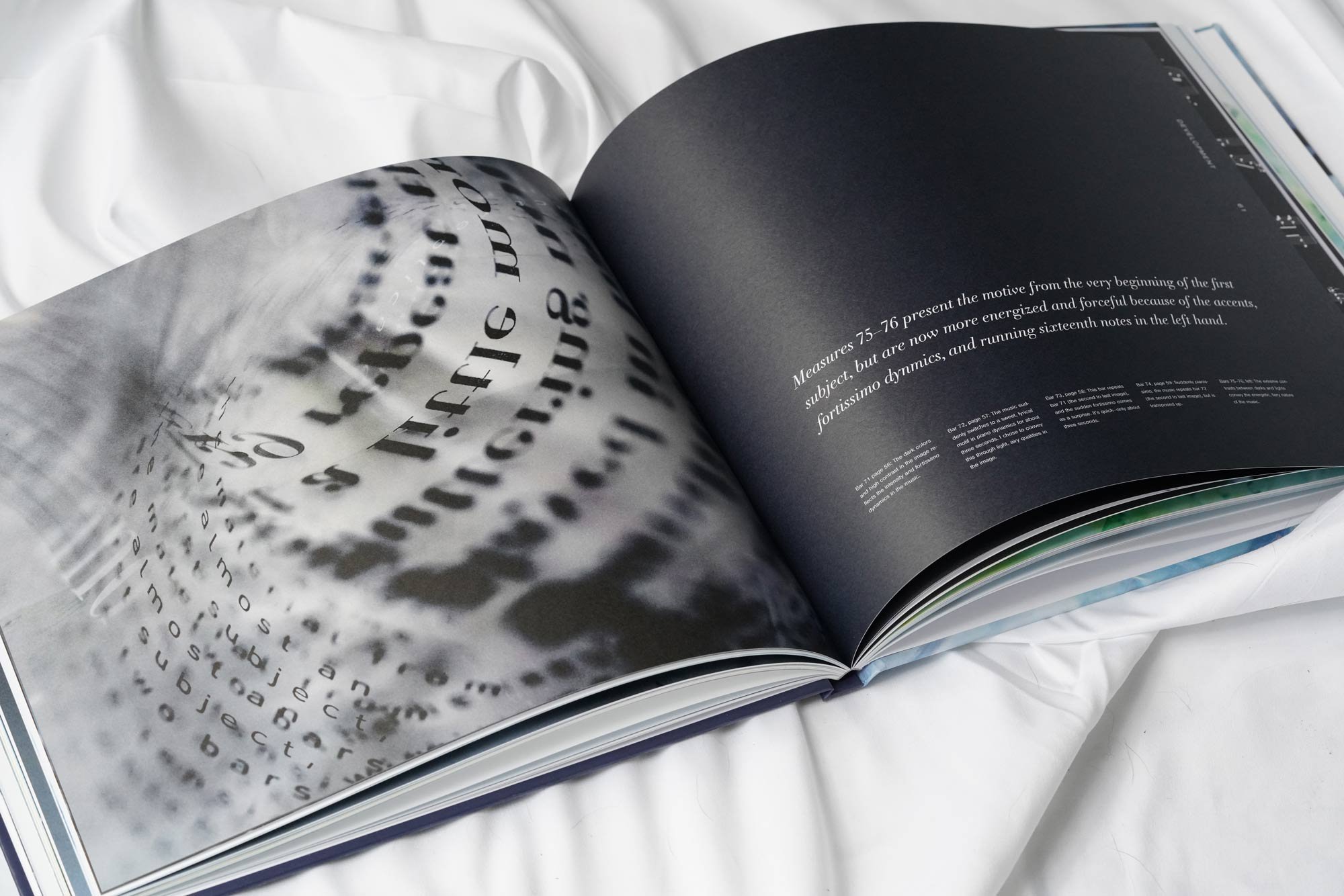
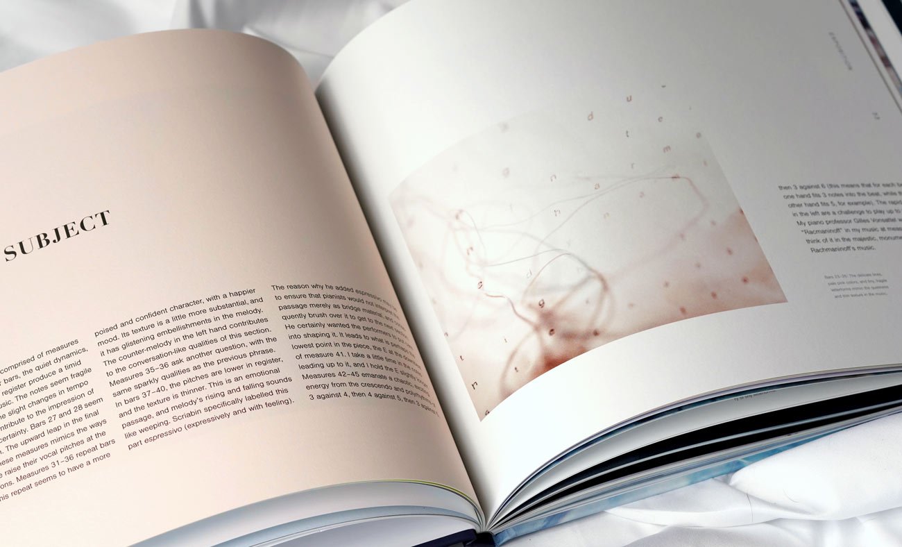
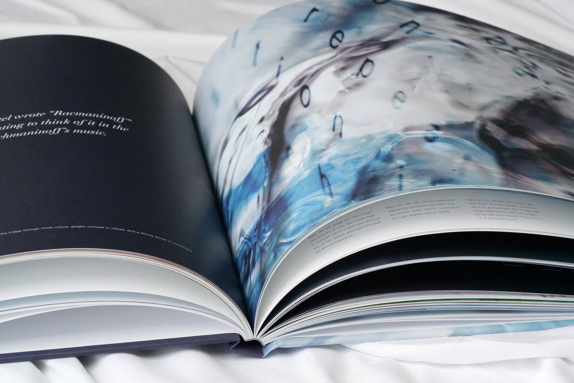
I created one image for each phrase or short musical idea in the first movement, for a total of 45 images. I designed them into a book, and I designed the pacing and structure of the book to reflect that of the music. The book communicates the different rhythms, harmonies, melodies, and characters, and expressiveness of each phrase through color, composition, and type.

I structured the book according to the structure of the music. The movement is in sonata form, which is made up of three main sections: exposition, development, and recapitulation. Each main section is made up of several subsections. For each of the subsections, I began the left page with a solid background color, along with text that describes the music. The three columns represent the music’s meter, 3/4 time. Because Scriabin wrote this piece with an ocean experience in mind, I implied a seascape horizon line that runs along the top edge of the columns.
I chose two typefaces: Didot bold for the main headings, and Nimbus Sans light for the subheadings, page numbers, captions, and main text. I chose Didot because the high contrast between thick and thin and elegant feel match the sonata’s beauty, sophistication, and contrasts between dynamics and articulations. Nimbus Sans is easy to read at small sizes, and it complements Didot nicely.

I arranged the images on the pages according to the feel of the music. For example, the music in the transition section has a lyrical, flowing, improvisational feel. Accordingly, I made the images and text blocks be of different sizes, and arranged in a way that has a flowing feel that creates eye movement across the spread. I didn’t want a rigid arrangement, but I did want to align the elements to the book’s grid columns to ensure some structure and consistency.

The music has several fermatas (long pauses) in the music. When these occur, I laid out a blank spread with only the music notation. I chose for it to be gray (normally music is printed in black ink) to give it a quieter presence to match the silence in the music. The line of music runs along the seascape horizon line.


To see each page, please view the book on Blurb.